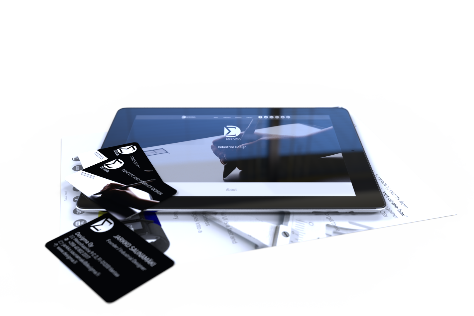
Desigma Ltd. is a design consultancy. As a Founder, I naturally create all the presentation material.
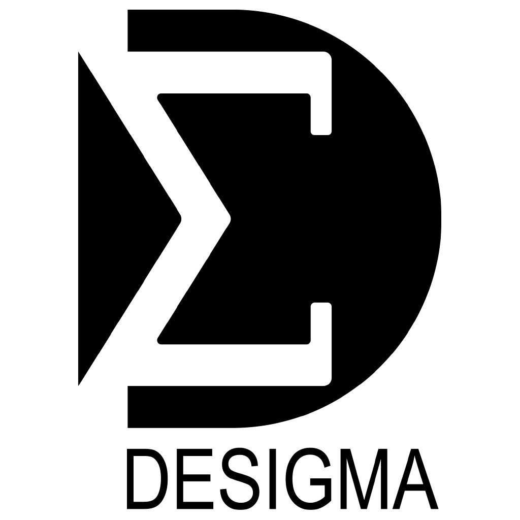
Desigma sounds a bit like design but does not mean anything. It was in my mind already years before founding the company.
The symbol is a combination of letter "D" as for design, and letter sigma "Σ".
I need the logo mostly to mark the visual presentation material. There is only black and white version that works also as a negative. The heavy appearance makes it visible on top of an image.
I don't use photos on business cards, but a hand drawing on a Wacom board is quite explanatory. Although, I use a Wacom display for drawing, a tablet to replace the computer mouse, and have a couple of other Wacom products.