Suomeksi (in Finnish): jarkkosaunamaki.fi/bensiinikanisteri
Role: concept design, industrial design, animation and editing.
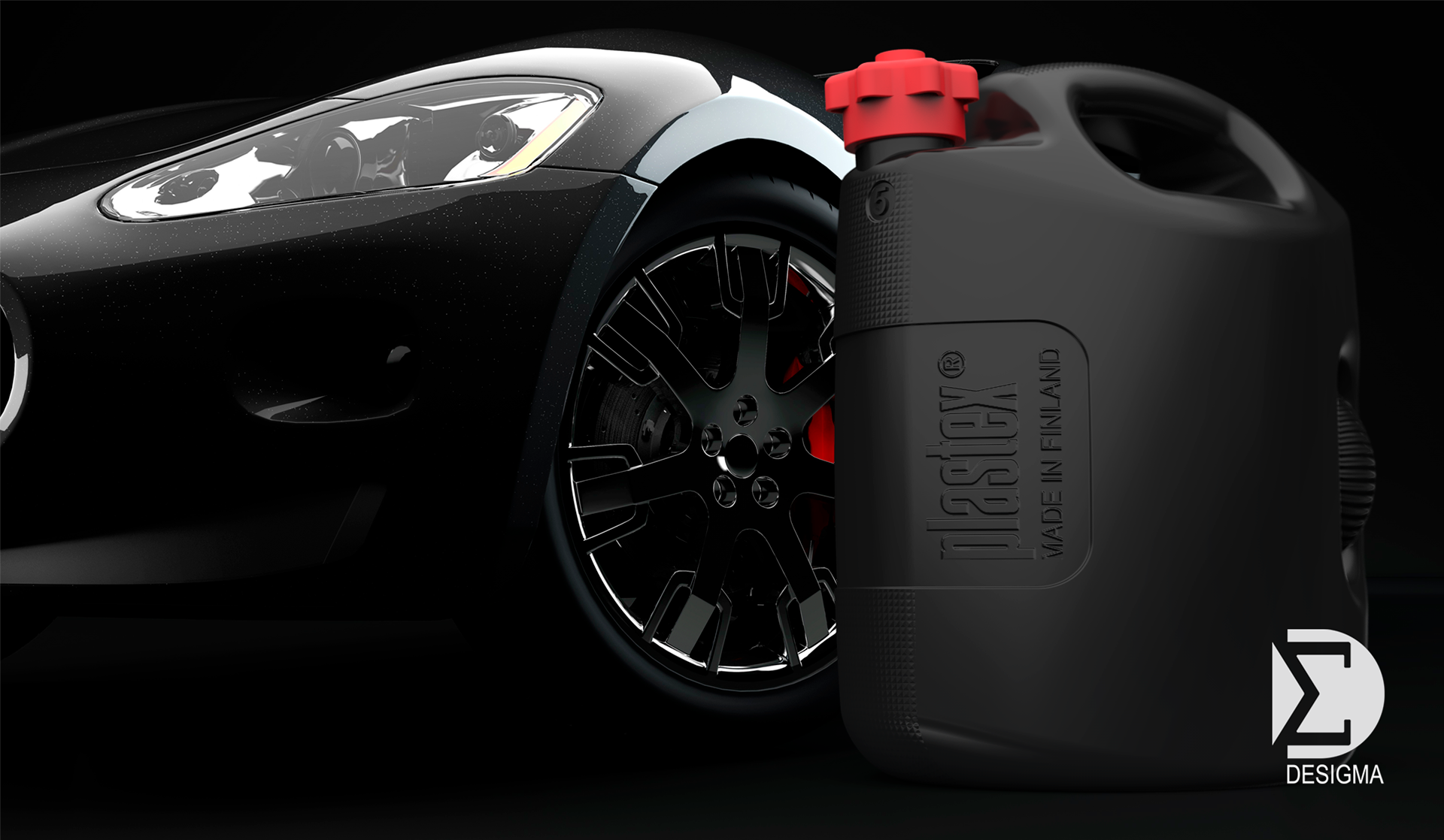
Petrol can concept for Plastex
It’s rare that I get to explain the design process. Normally it’s the finished product that ends up in the public and when we’re talking about concepts, there’s not even a product to showcase. The collaboration with Plastex started by surveying how Desigma and its Kööri product development network could help the client after having met with them. The first project that Desigma would be responsible for was redesigning the 5-litre petrol can.
Goals
Plastex had already gathered some feedback for their petrol cans and together, we met with their clients. We went through the entire user experience with them, discussing the product’s entire life span from how the product need is created to recycling and buying a new product.
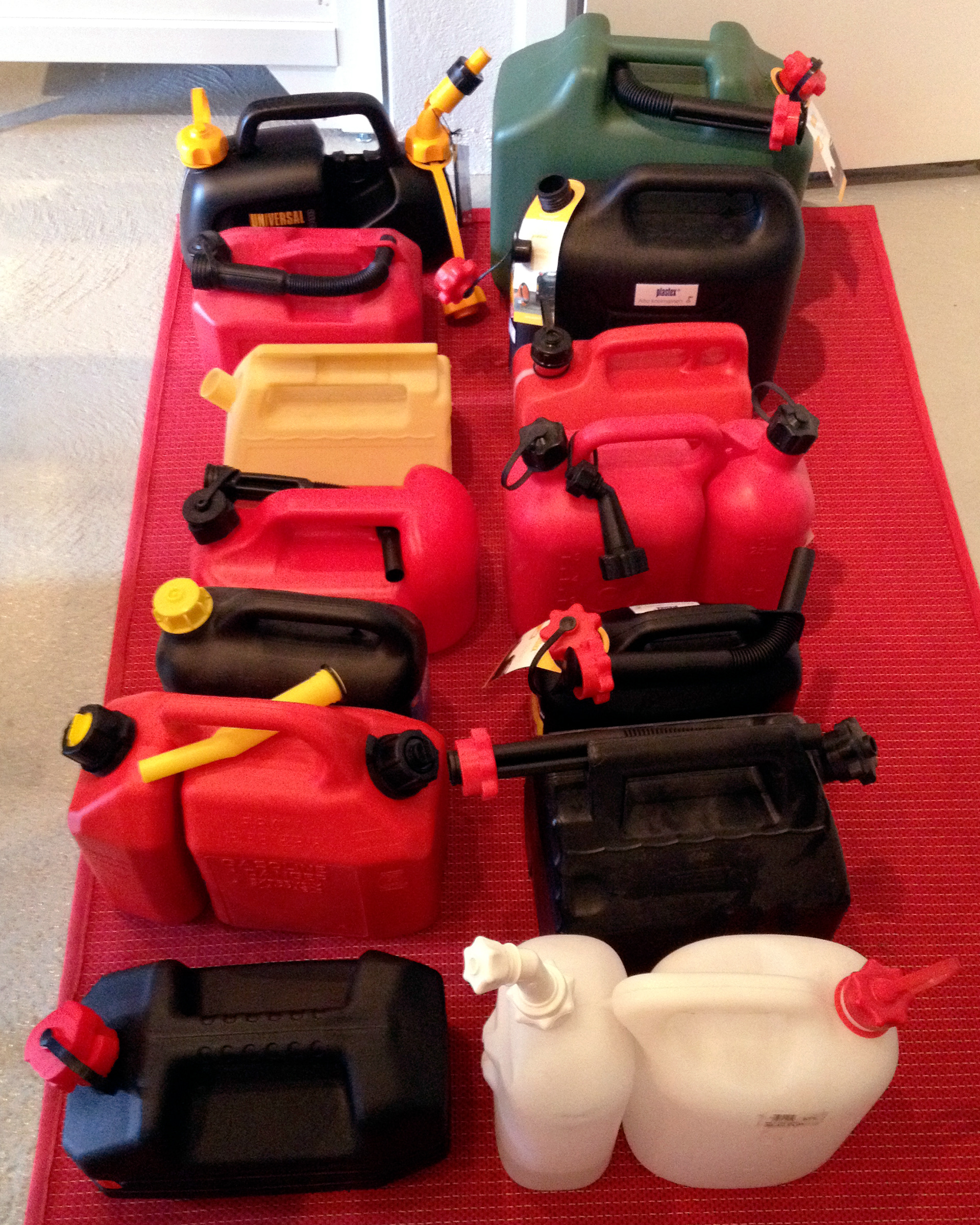
We wrote the design commission together with Lauri Ant-Wuorinen, CEO of Plastex. We had an initial workshop with Plastex’ management and a technical expert from the factory. We compared our product to the competitors’ products.
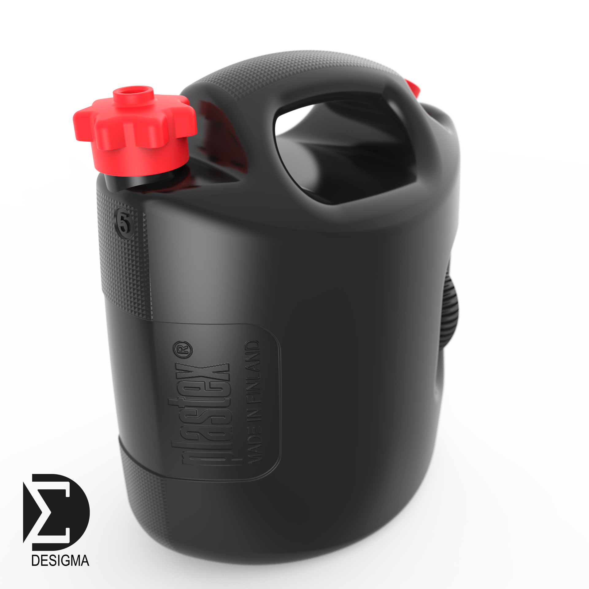
Our three main goals were a vented cap in the can, an easy pour from the can, and the cannot falling over. From the very beginning we were thinking of the entire product family with five, ten, and twenty litre cans.
The blow moulding set some limits for the design. The product would be produced with a natural mould, and we needed to consider the shrinkage of the material and minimum rounding. The processability with the existing blow moulding equipment set the maximum measurements for the product. Plastex’ petrol cans use the same popular cap so we didn’t want to redesign that.

Process
I used Pinterest for the mind maps. Unlike a collage on paper, it’s possible to update a digital mind map. It’s a good idea to save the original version though.
I modelled the product family so that it would be easy to present at the store. We gave up on modularising the product family already in early sketches as the cans have such a big difference in size.
From the first sketching round, we chose three alternatives that we would continue to work on. Besides these sketches that define the functional and visual features, I also made some suggestions that challenged the design commission; replacing the vented cap with other solutions, storing the spout, markings, and add-ons. Of these suggestions, we chose to use Velcro tape that helps keep the can upright in the boot of the car. It can be placed in a hollow designed for the product label; I will get back to this later.
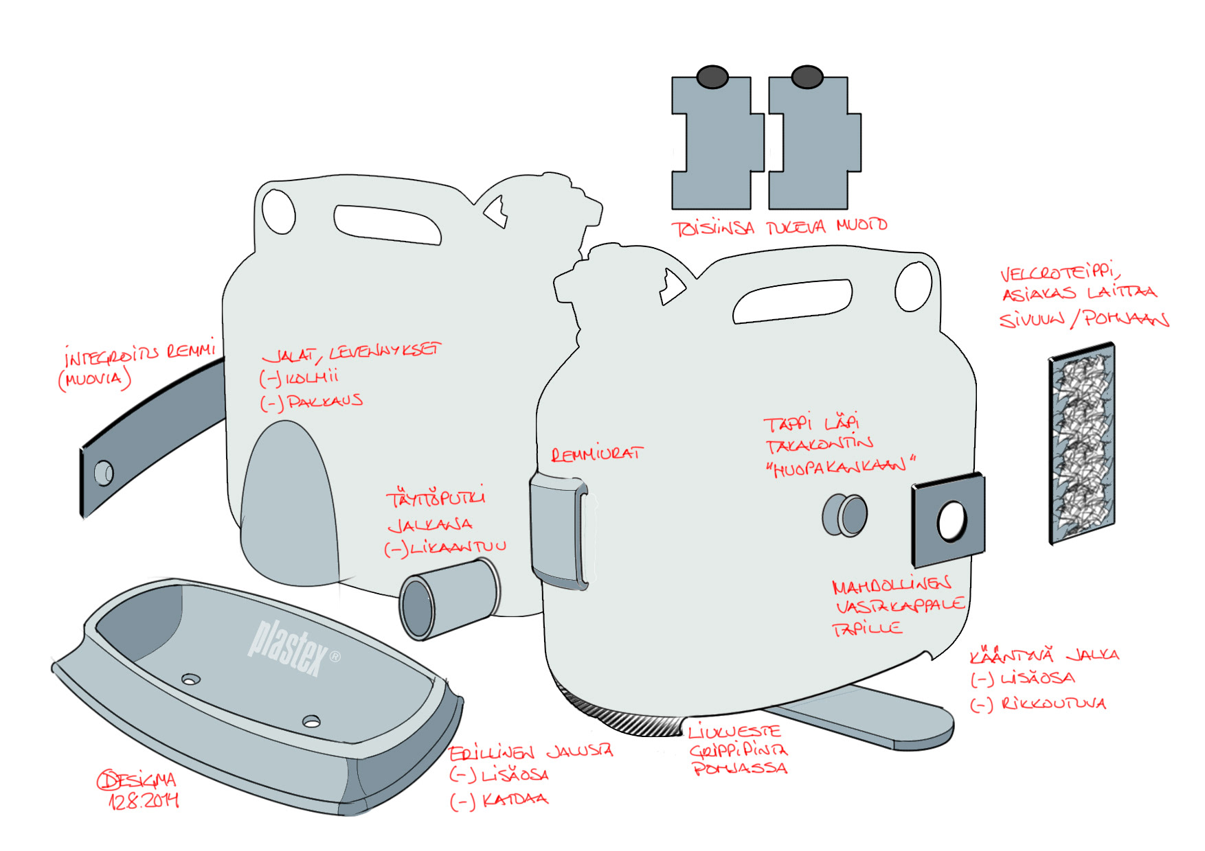
During the next round I moved to working in a ”2.5D” mode early on, which is a combination of two-dimensional sketches and early 3D models. Achieving the necessary volume with the maximum measurements of the production equipment affected the can design. I tried to place the mass centre low so that the can would stay upright better.
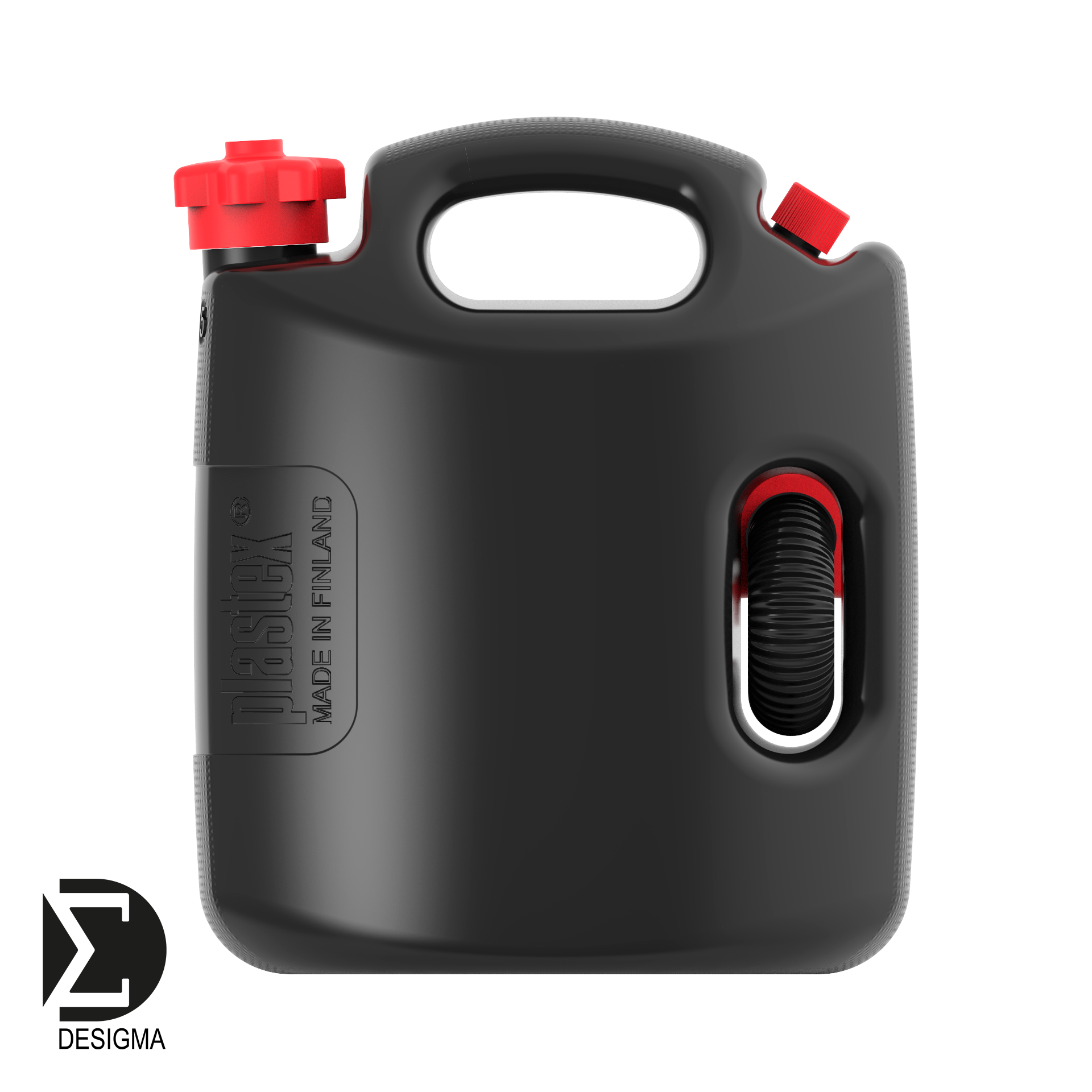
As we are choosing between the suggestions, we often ask for the users’ opinion. This time, however, the reasons were so clear that we made the choice in the product development team. Of the three directions we had taken earlier we discarded the one where the solid handle continues from the top of the can to the back of the can, as it would’ve been hard to place the vented cap. The other version of the low can was considered too ordinary, even though it had a good centre of gravity. The version that had a separate handle for pouring and carrying was the most popular option. It’s taller than the other versions, but as the volume is larger at the top, the can could have freer shapes. The can mass is basically an upright rectangle, but the centre of gravity is low as the level of fluid doesn’t reach the carry handle.

Design
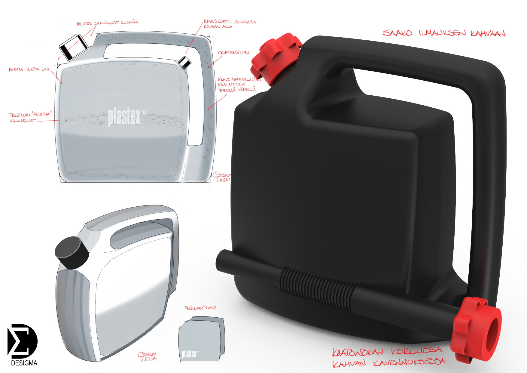
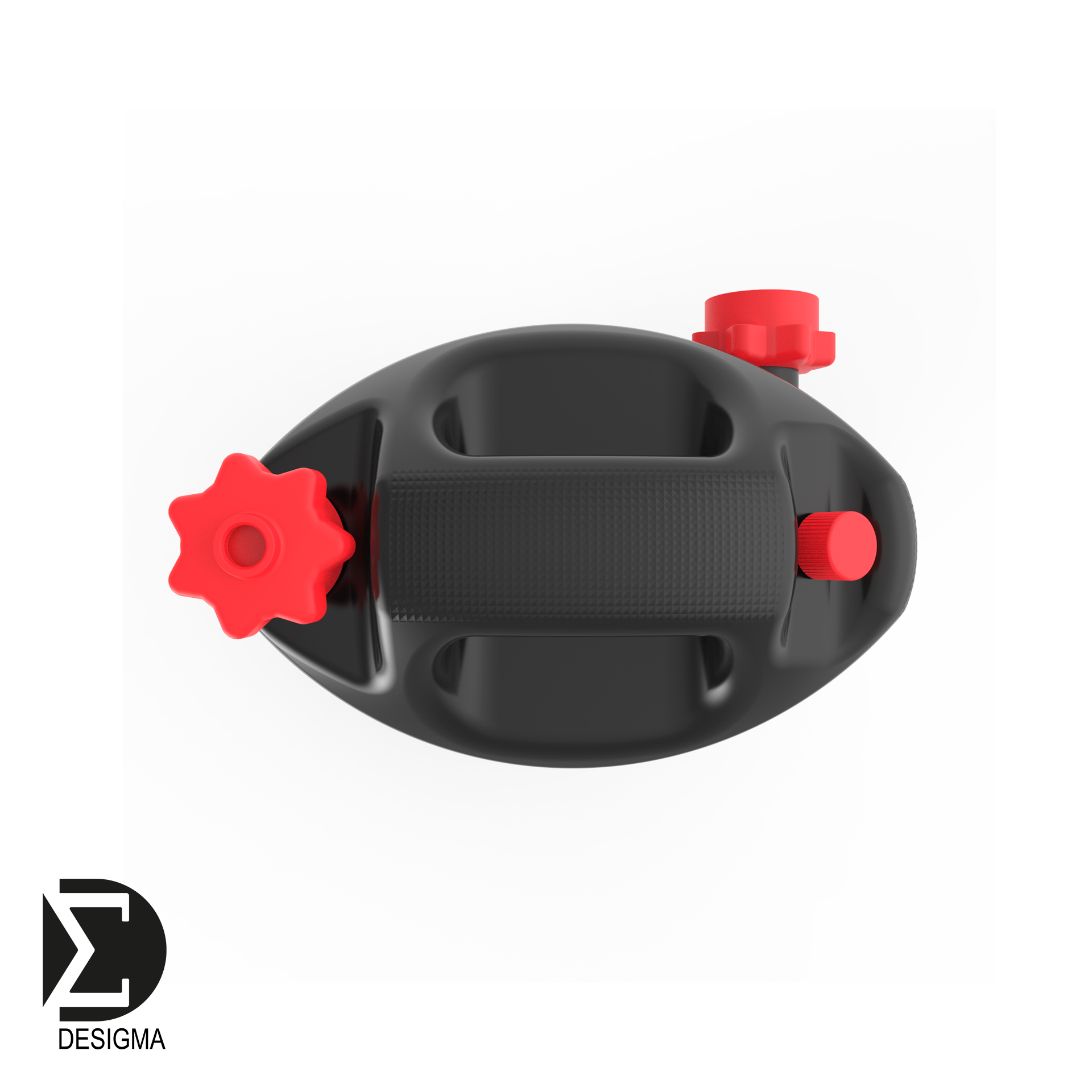
As we’re talking about a petrol can, I wanted the form to be full of speed. The geometric forms last better than plastic shapes and we hope that the can will be sold for decades to come. All surfaces are geometrically curved. The surfaces come together with cuts that give character, and they are as sharp as the production technique allows. From the top, the can is a lens, with the narrow front and back sides showing the curved handles. On the side, you can see the curved carry handle, the curve between the handle and the cistern, and the curve between the cistern and the bottom. The curvature is also functional as the petrol cans must pass security tests and the curved shapes reduce the point source input.
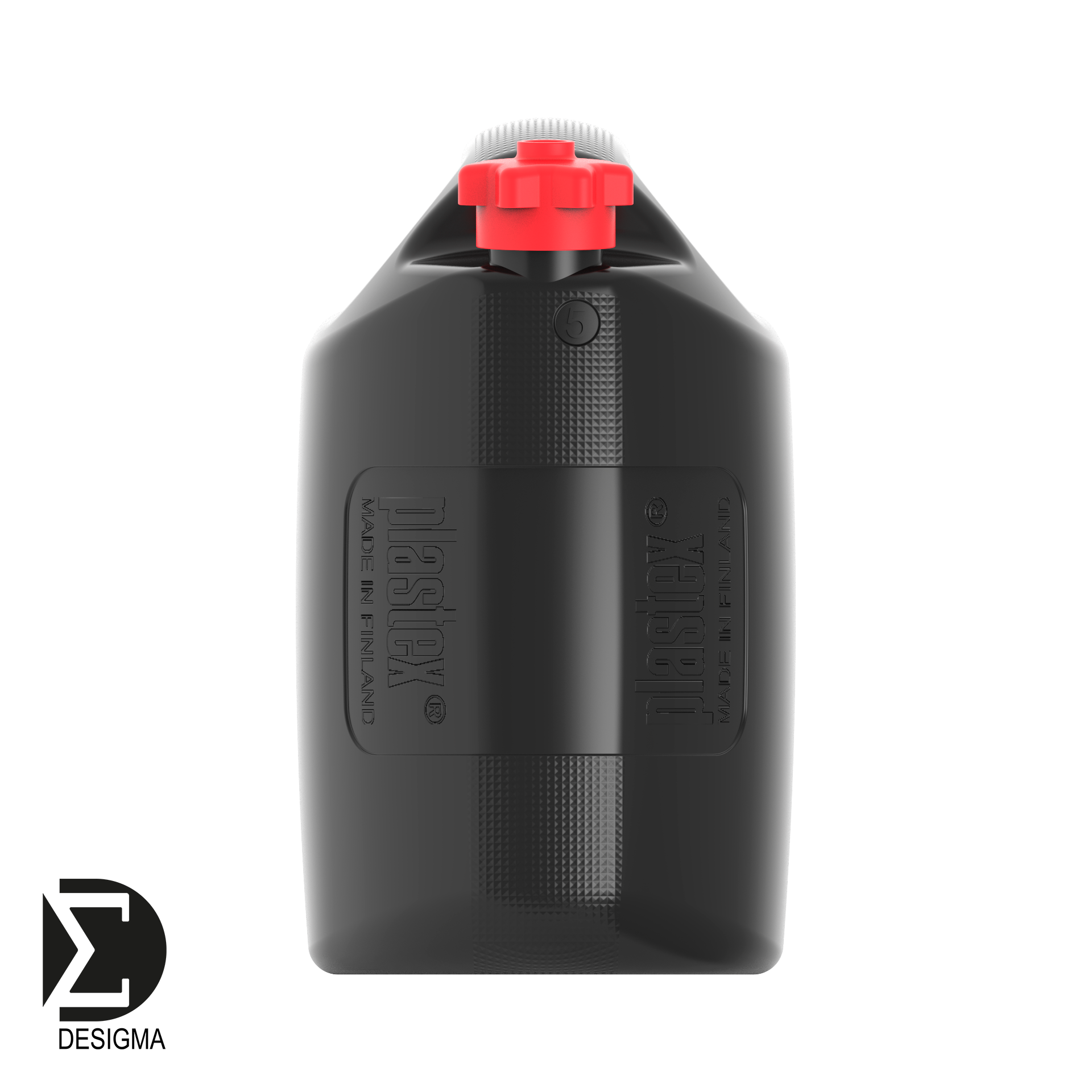
Even though the bottom is lens-shaped, the middle part is >70% wider against the ground than before. This reduces the risk of falling sideways. The rounding between the bottom and the cistern varies in radius. For functional purposes, it’s as small as possible in the centre and grows towards the front and back as the form brings speed.
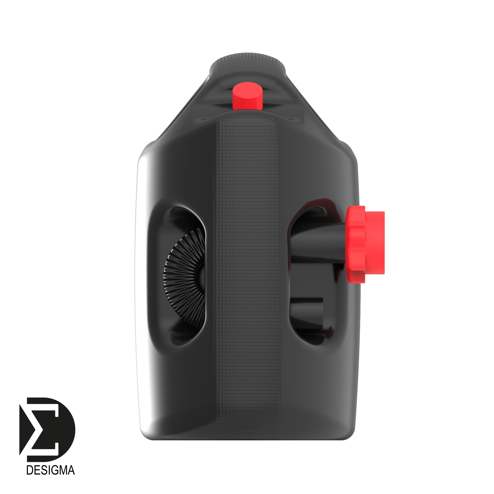
The handles have been measured so that they can be used with gloves. It’s possible to use both handles for pouring, or the carry handle at first and as the can becomes emptier, you can switch to the pour handle. This way, your hand will not be bent in a non-ergonomic way. The pour spout is stored in the pour handle. The handles protect the cap and vented cap from hits. The ventilation could be adjusted with a vent-like cap that is pushed down with the thumb, if that’s the end-solution. The handle texture hides the dents the can might have acquired and makes it more pleasant to hold.
The texture could also be used on the side surfaces where it would decrease the stroke signs that typically happen with this production method. However, we weren’t sure of its possible effects to the durability of large surfaces in safety tests. The Plastex and Made in Finland logos are embossed on both sides.
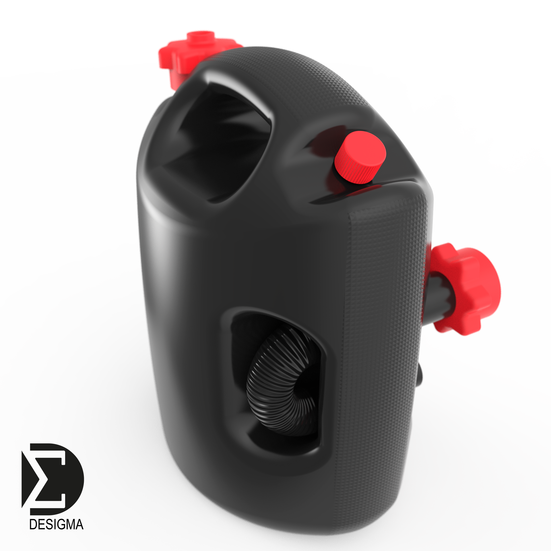
At the stores, the cans will be presented with the front or the side visible, so that the product label on one side would be hidden. To avoid several labels, I designed a hollow for the label that continues from the front to both sides. The previously mentioned add-on Velcro tape can also be placed in the hollow. The pour spout will be attached with another sticker to hinder shoplifters.

The product label appears on the front and sides of the canister. One can also place a Velcro tape in the recess to support the canister from falling on a trunk or boat. Since the surfaces are curved, the sticker is grooved into three parts connected by the bridges. The label is first placed on the front and then on the sides.
As the 3D model already exists, for a former animator like myself it was natural to create a product animation.
The design realised the main goals we were given and simultaneously we also solved a few other problems. The end result is a practical can with a design that fits the speedy theme.
Jarkko Saunamäki
Industrial Designer
Desigma
Industrial Designer
Desigma
Programs:
Autodesk Alias Design
Autodesk Sketchbook Pro
KeyShot
Adobe Illustrator
Adobe Photoshop
Adobe Premiere
Autodesk Alias Design
Autodesk Sketchbook Pro
KeyShot
Adobe Illustrator
Adobe Photoshop
Adobe Premiere
Inquiries:
www.plastex.fi
www.plastex.fi